Overview
Guidance for parents, with the content operations to sustain it.
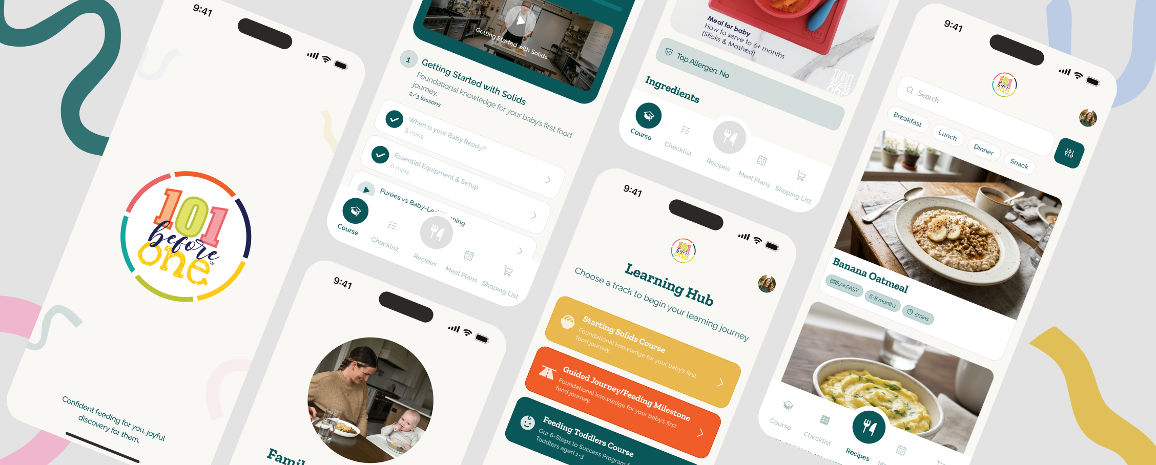
101 Before One is a starting-solids program built around family meals. The product experience brings courses, recipes, weekly meal plans, food tracking, shopping lists and support into one mobile journey, while an internal admin app gives the team a structured way to manage the guidance behind it.
My Role
As Product Designer, I shaped the parent-facing mobile experience and the supporting admin web app shown in the final designs. My focus was the information architecture, end-to-end flows, interface system and the relationship between the content parents use and the tools the internal team needs to maintain it.
The Problem
Starting solids can turn every meal into a new decision.
Parents may need to understand readiness, allergens, nutrition, safe preparation, recipes and feeding progression at the same time. The company describes the alternative as hours of Googling and piecing guidance together alone. The product challenge was to make that breadth feel clear and usable in the moment, while giving the internal team a practical system for keeping foods, recipes, courses, meal plans and support content organized.
The Goal
Turn expert guidance into a clear path from learning to mealtime.
The goal was to create one connected system that helps parents understand what to do next—from learning and choosing meals to shopping and tracking progress—while enabling the team to manage and publish the content that powers that experience.
How I Kicked Things Off
Starting with the relationship between content and action.
The visible product architecture became the starting point: a child’s stage and preferences provide context, courses explain the why, recipes and meal plans turn guidance into meals, and checklists and shopping lists carry the work into everyday routines.
I treated the mobile app and admin web app as one system rather than two separate interfaces. Each parent-facing destination was paired with the internal content structure required to keep it useful—from foods and recipes to curriculum, weekly plans and support.
The Solution
One system, from first question to everyday routine.
The final design connects a personalized mobile journey for parents with the operational tools needed to create, organize and support that experience.
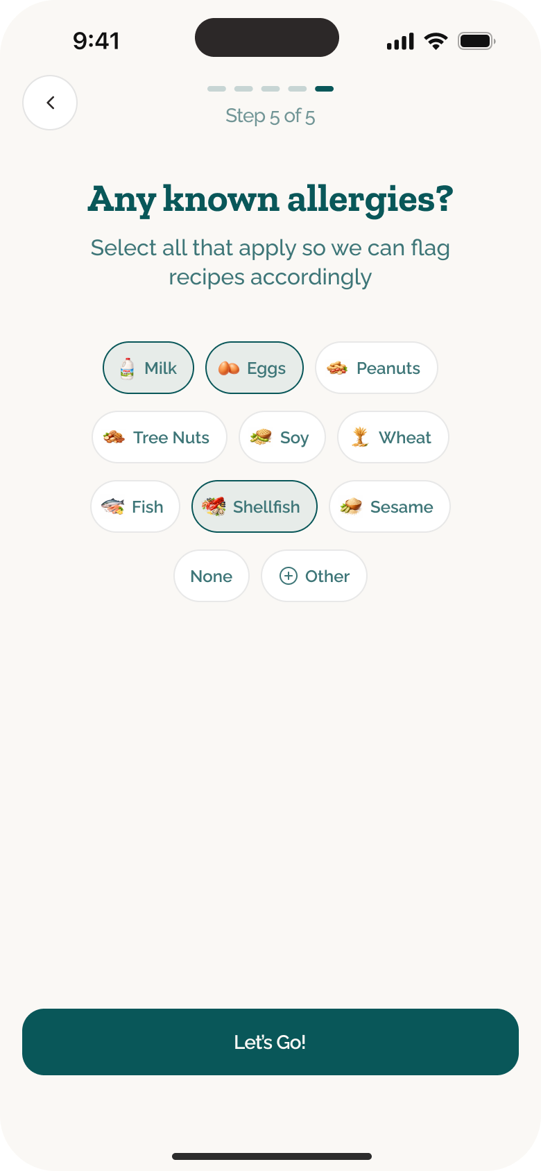
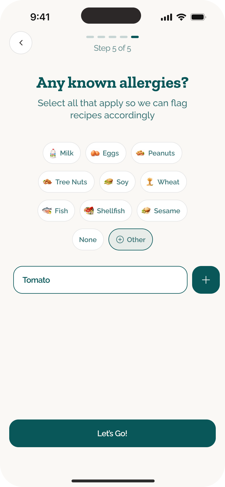
Personalization before content
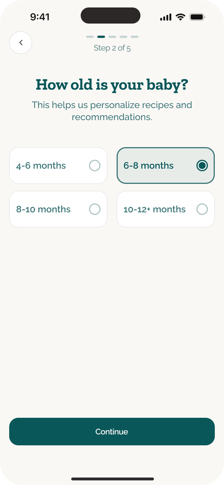
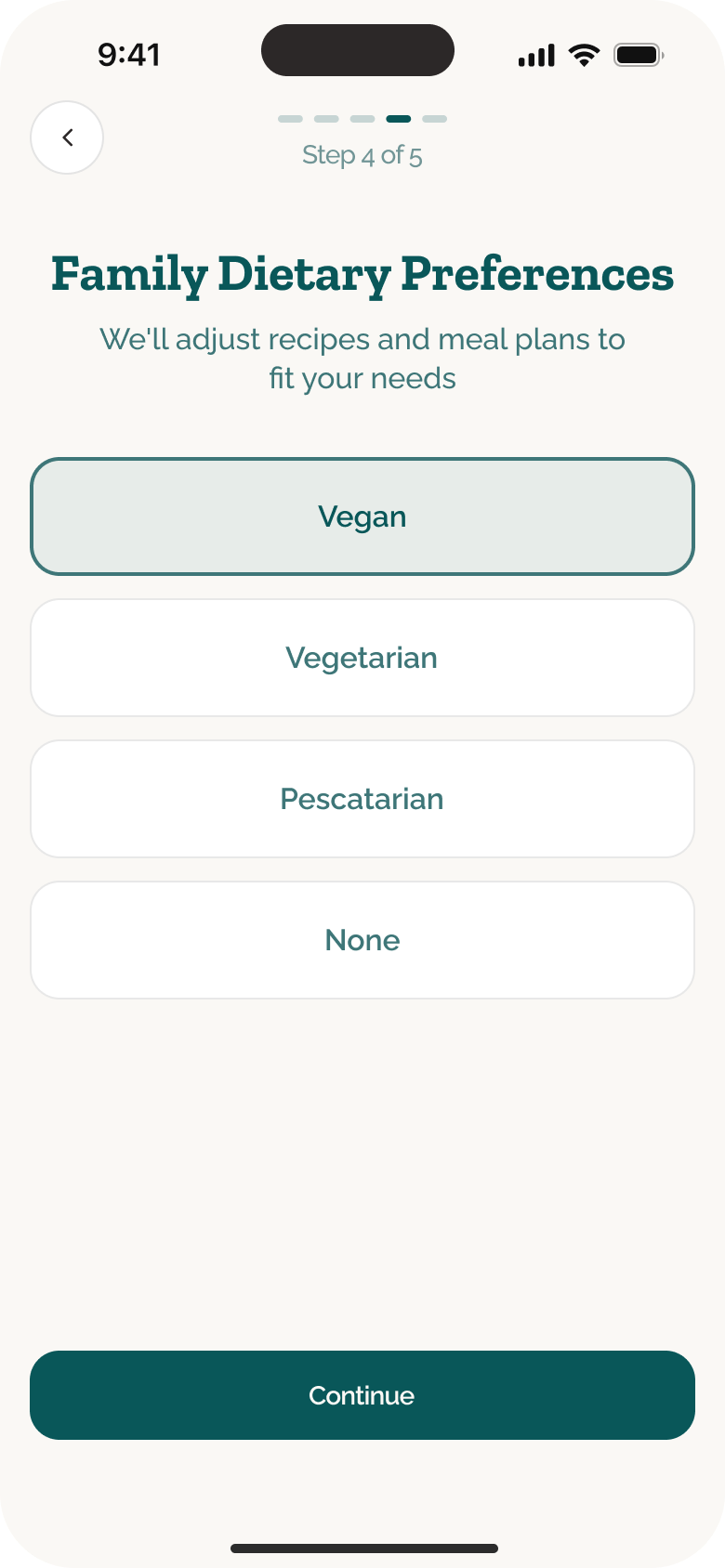
Onboarding captures the baby’s age, family dietary preferences and known allergies before recommendations appear. This gives the product the context to tailor recipes and meal plans to the baby’s stage, respect how the family eats and flag options that may be unsuitable.
A guided learning path
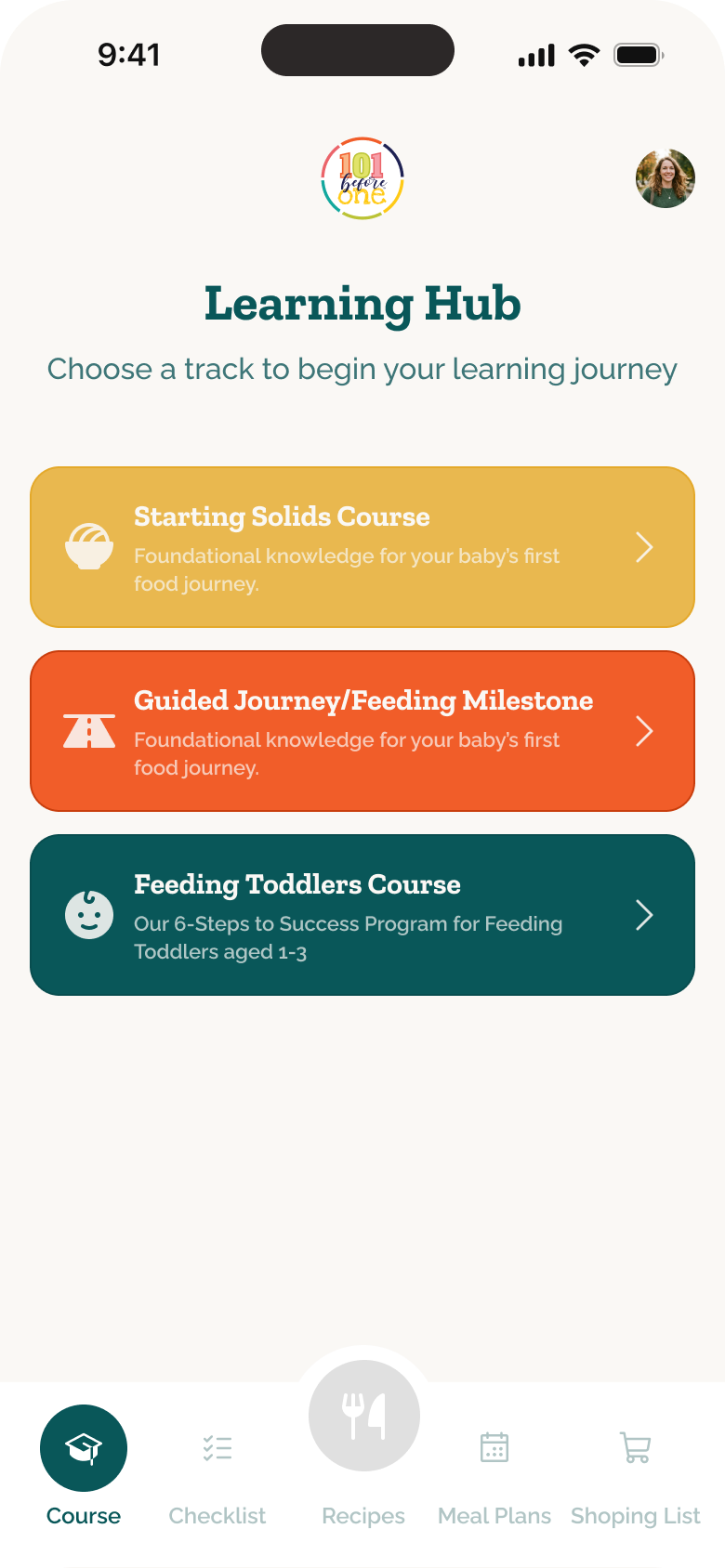
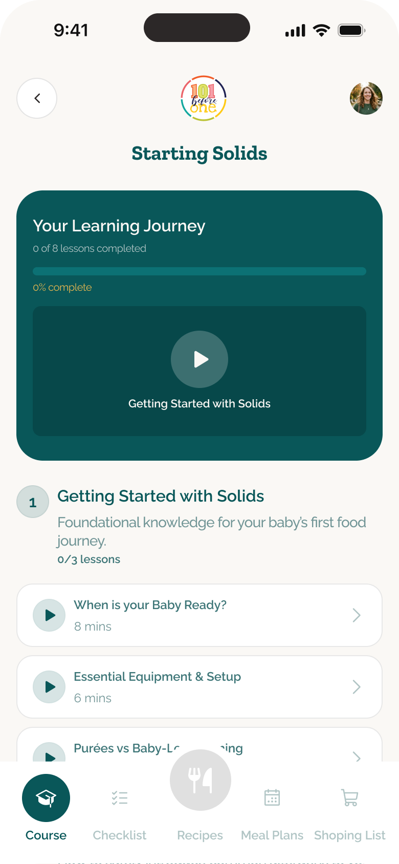
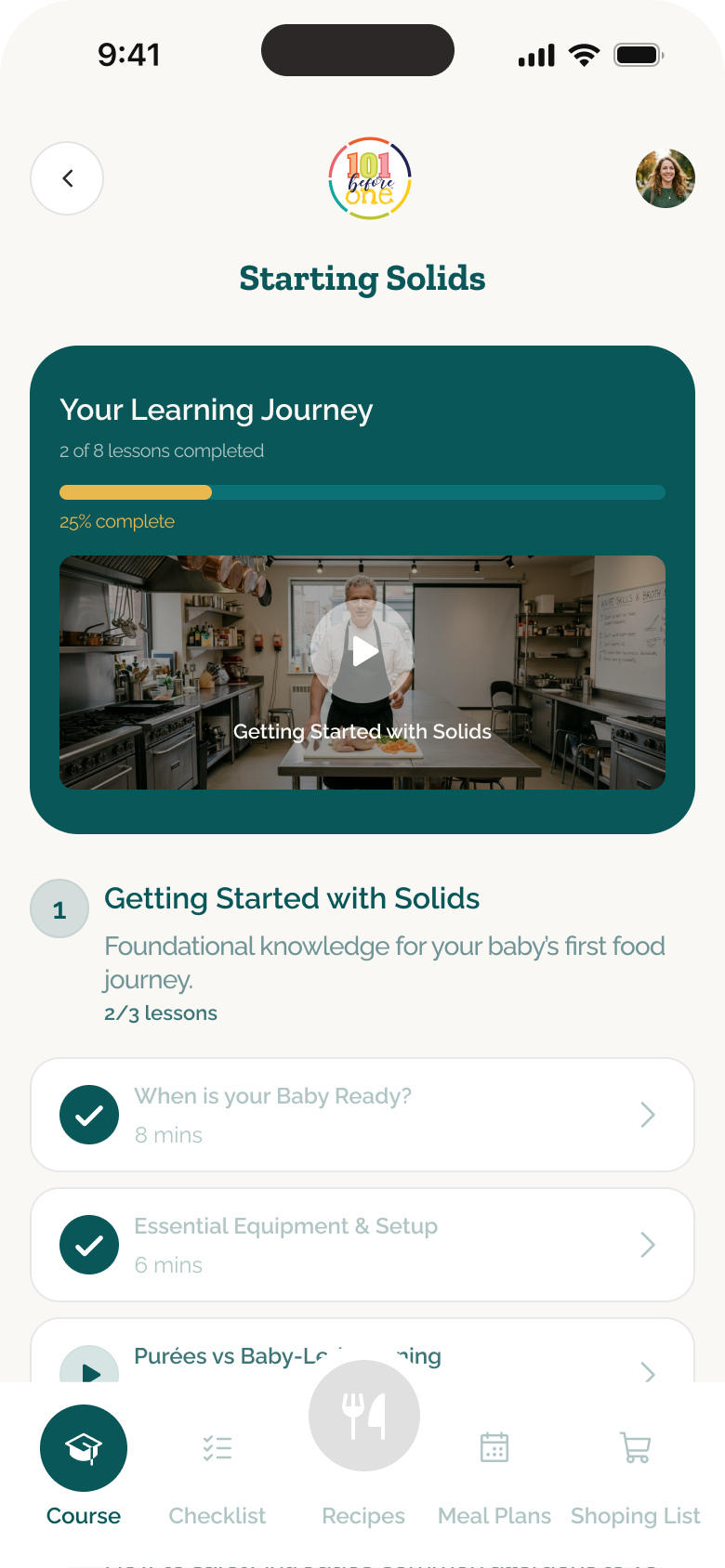
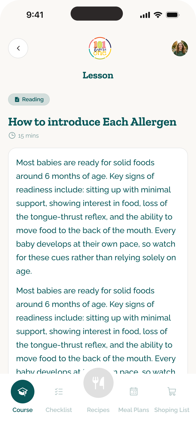
The Learning Hub separates the program into clear tracks before each course breaks guidance into modules and short lessons. Parents can see what they have completed, return to the next lesson and open detailed reading without losing their place. The design intent is to make a large body of feeding guidance feel like a paced journey rather than an unstructured content library.
Recipes built for faster, safer choices
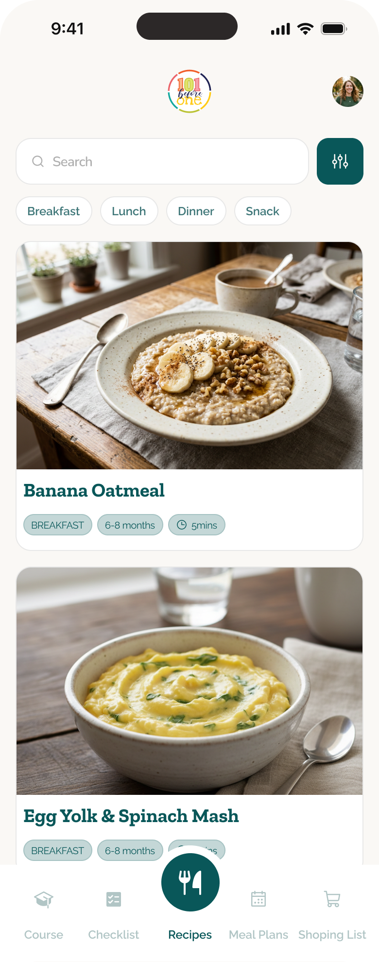
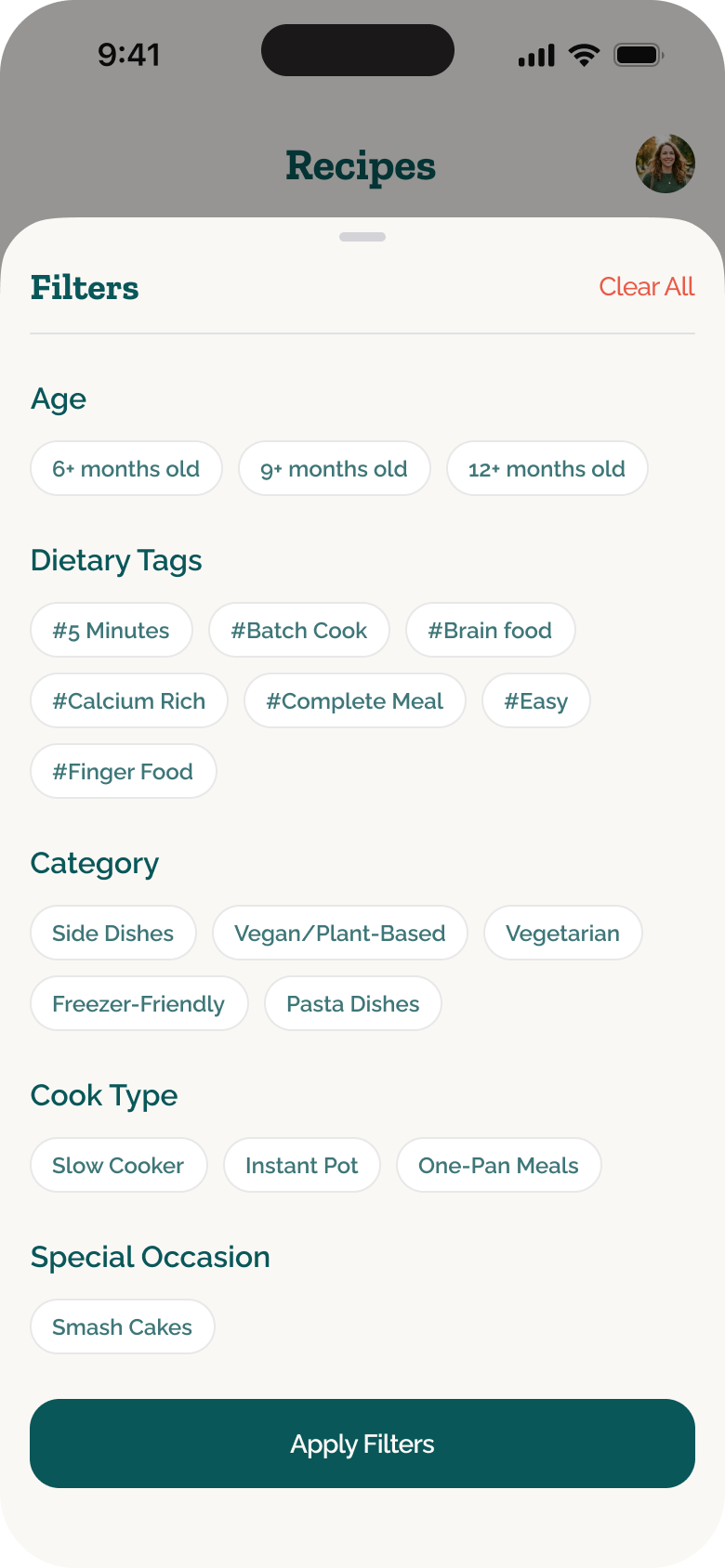
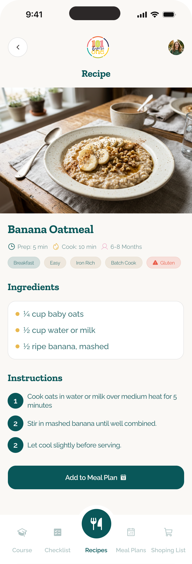
The recipe library makes a large catalogue easier to navigate through search, meal type and filters for age, dietary needs, category and cooking method. Each recipe brings serving stage, ingredients and preparation guidance into one place, with a direct path into meal planning. The decision was to support both quick browsing and more deliberate filtering without separating discovery from action.
A weekly plan that removes daily guesswork
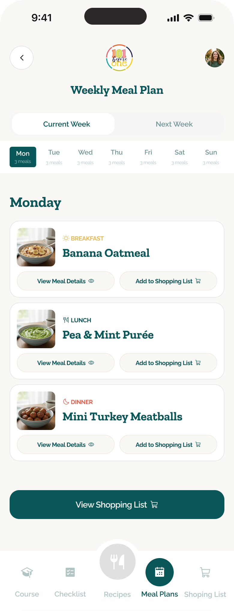
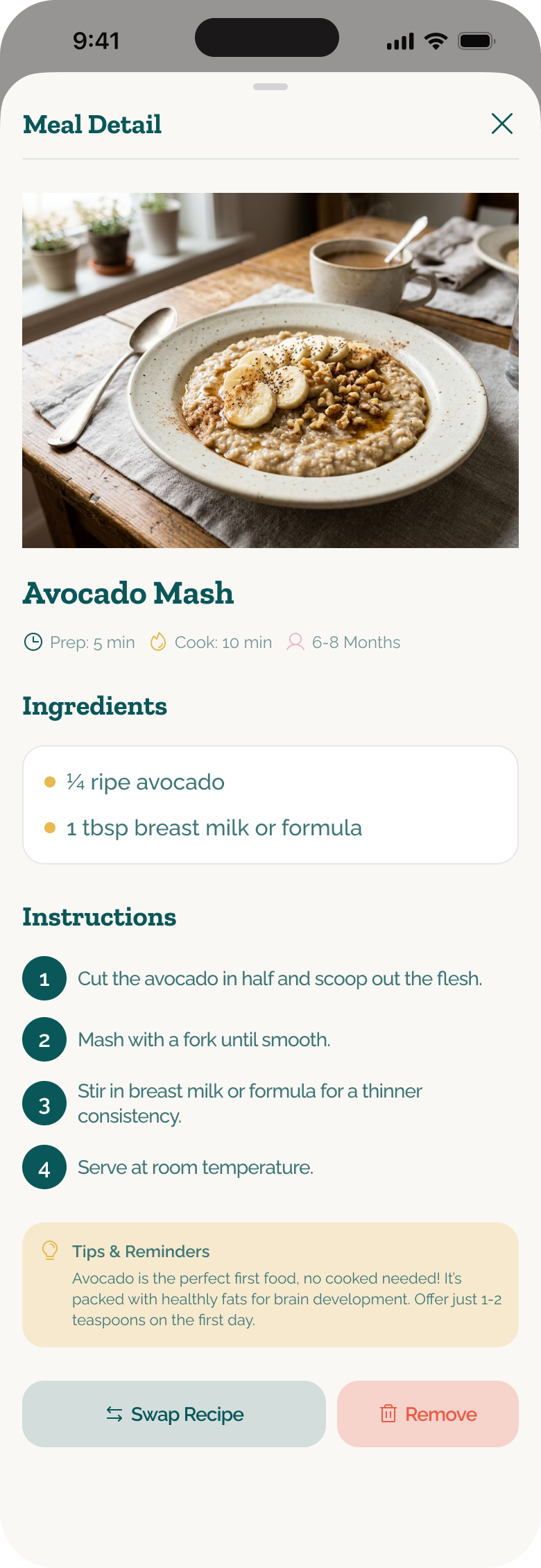
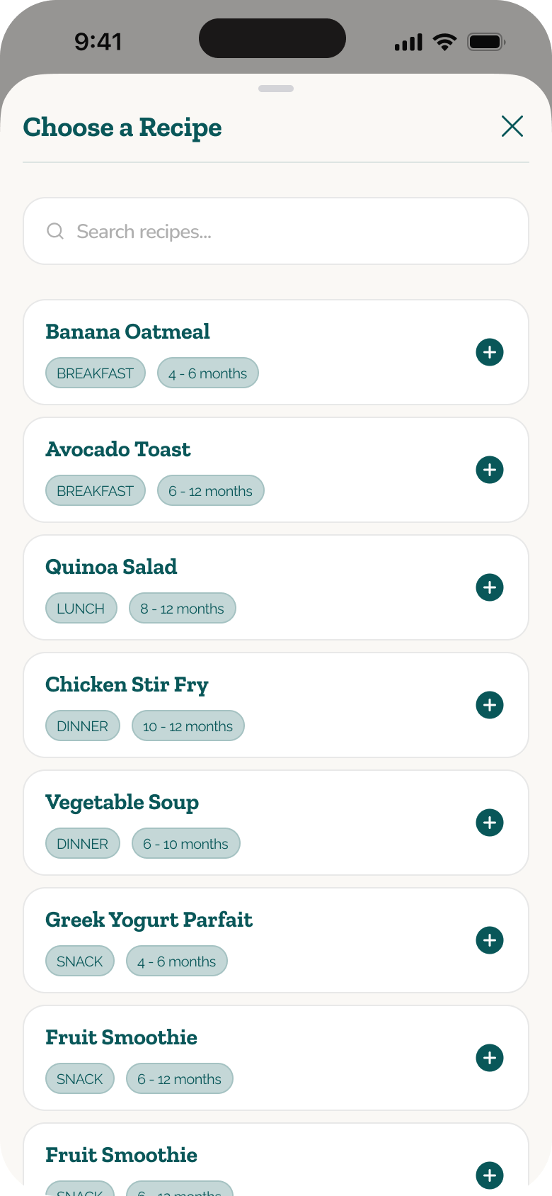
The weekly plan translates recommendations into a concrete breakfast, lunch and dinner rhythm. Parents can review one day at a time, open a meal for context and replace an option when it does not fit. Keeping those actions inside the plan makes the schedule useful without turning it into a rigid prescription.
A staged path beyond purées
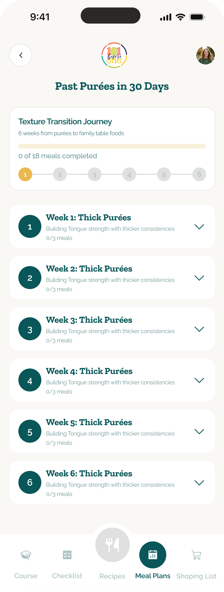
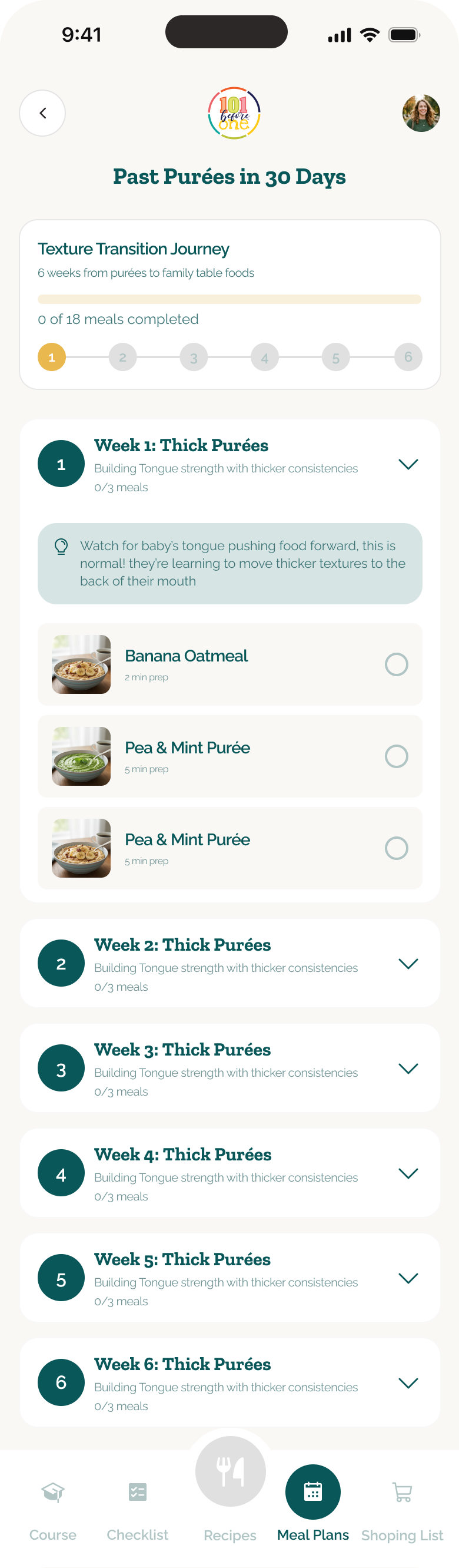
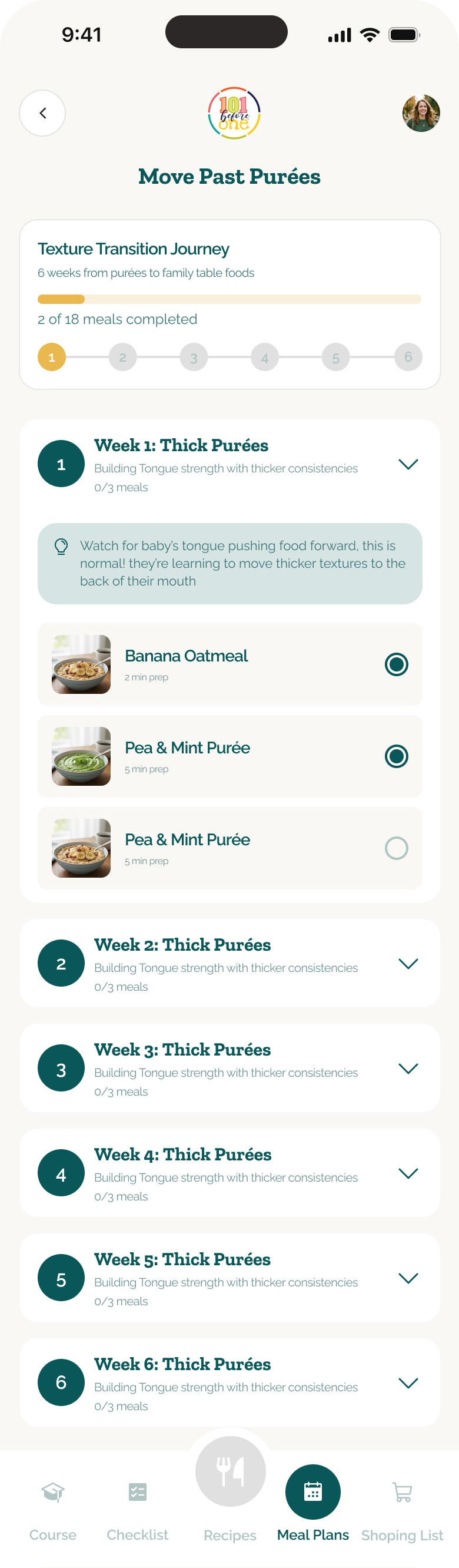
Moving from purées to family foods is treated as a progression rather than a one-time switch. The six-week plan introduces thicker textures in stages, pairs each week with practical guidance and makes completed meals visible. This gives parents a clearer sense of pace while leaving room to repeat a step when their baby needs more time.
First-month guidance becomes a routine
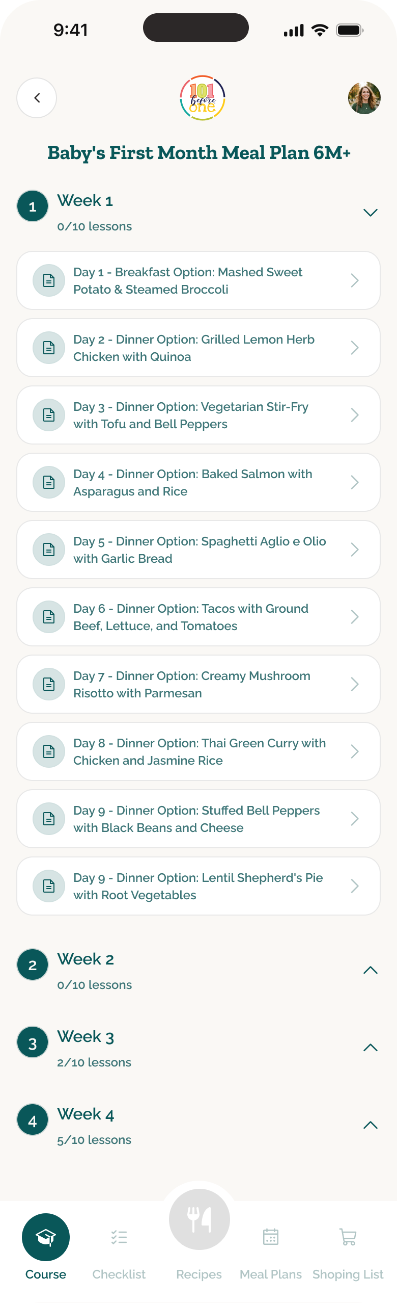
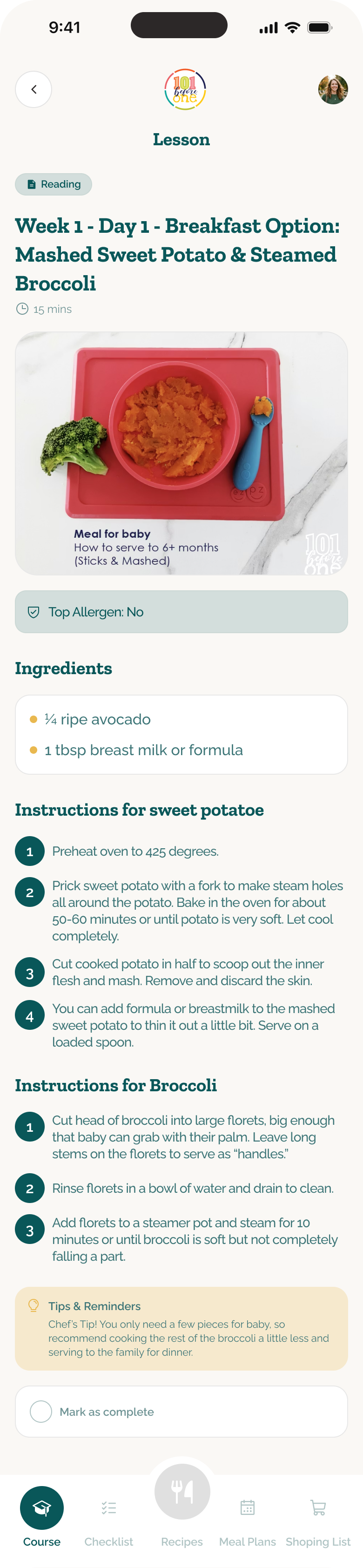
The first-month plan connects course content with a day-by-day feeding routine. Parents can see the sequence across four weeks, open a specific meal and work through preparation, serving and safety guidance before marking it complete. The design bridges education and action so advice arrives at the moment it is needed.
A shopping list that closes the loop
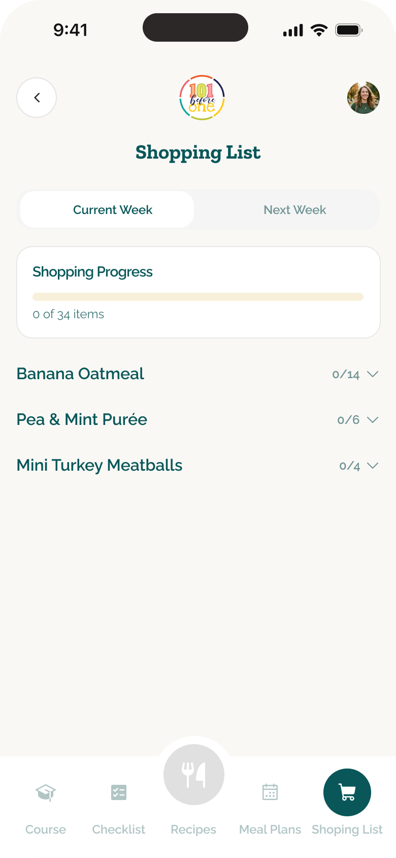
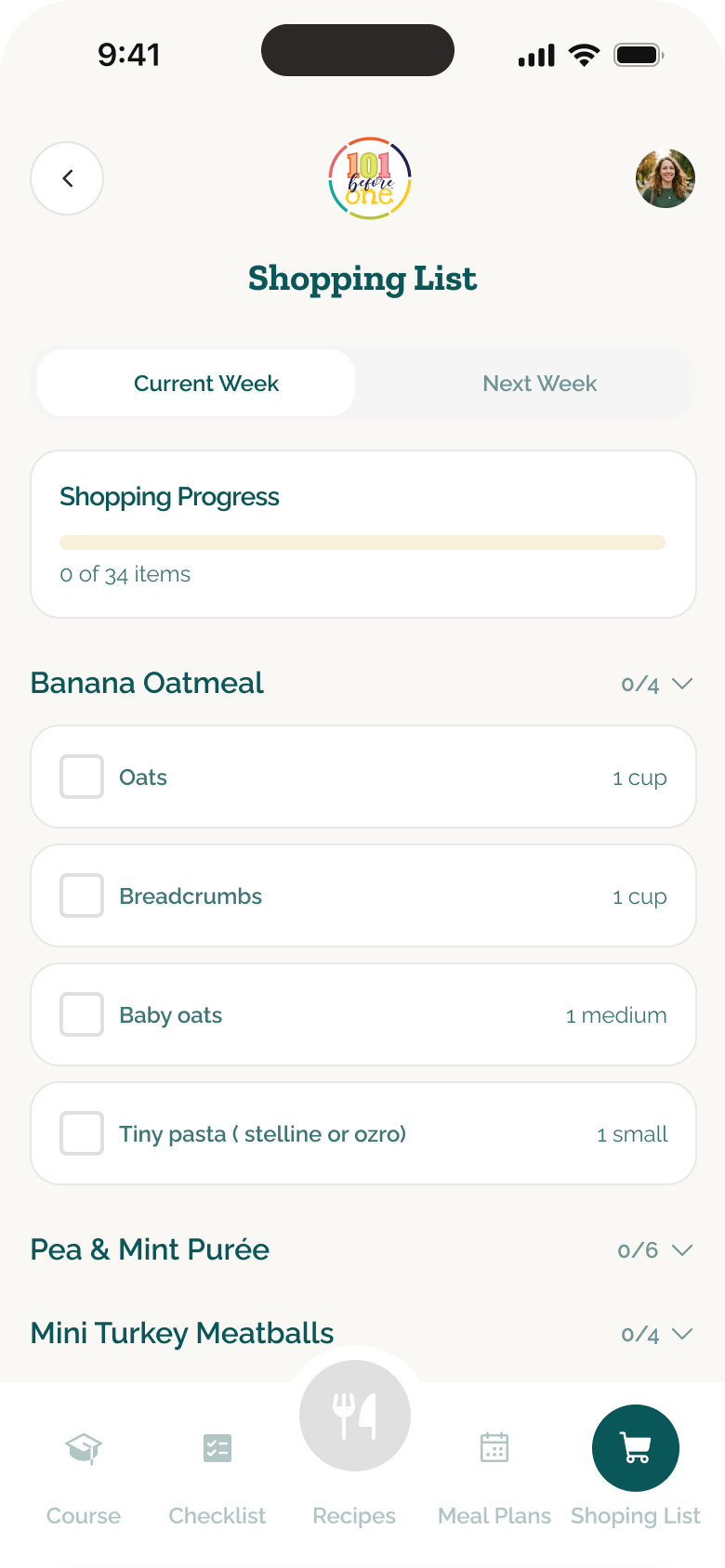
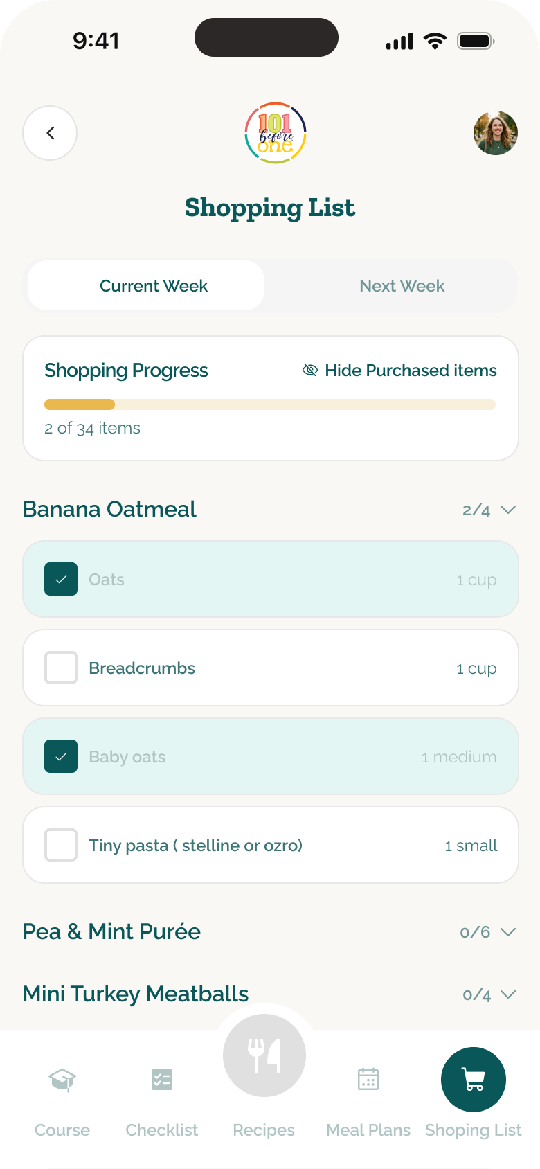
Ingredients from the selected plan are grouped by meal inside one weekly shopping list. Collapsed groups keep the list scannable, while expanded and checked states support shopping in the aisle and show overall progress. Parents can hide purchased items to focus on what remains instead of rebuilding the list elsewhere.
Progress that stays useful
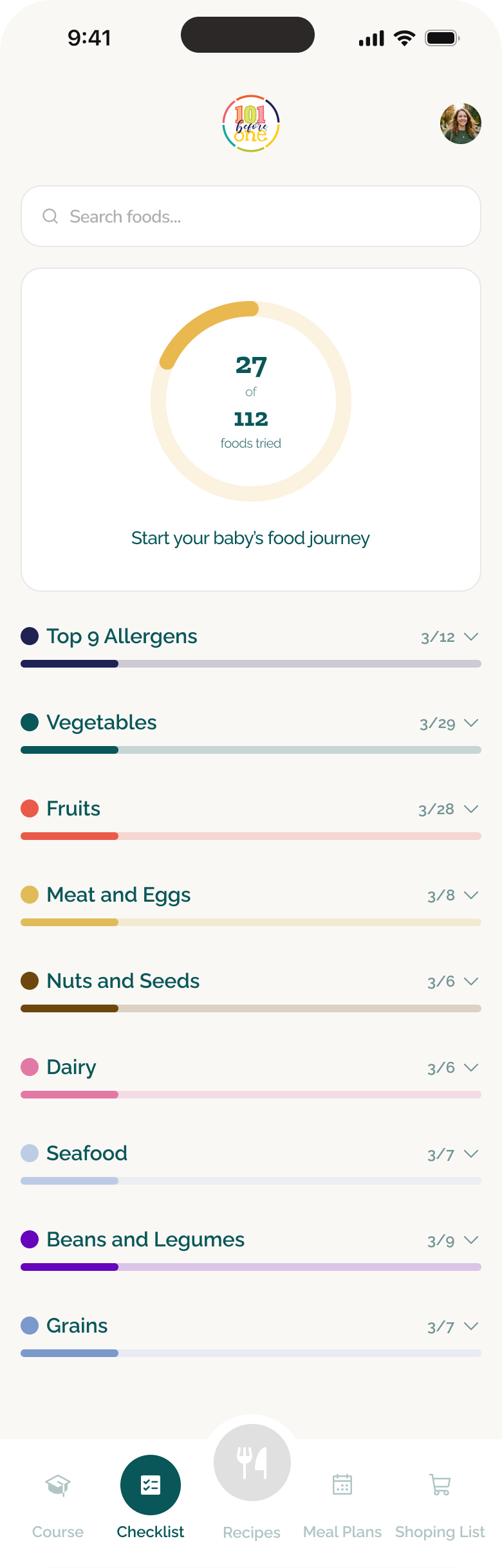
The food checklist turns a broad goal into visible, incremental progress. Search, grouped states and individual food entries help parents see what has been introduced and what remains without leaving the wider feeding journey.
A content engine behind the app
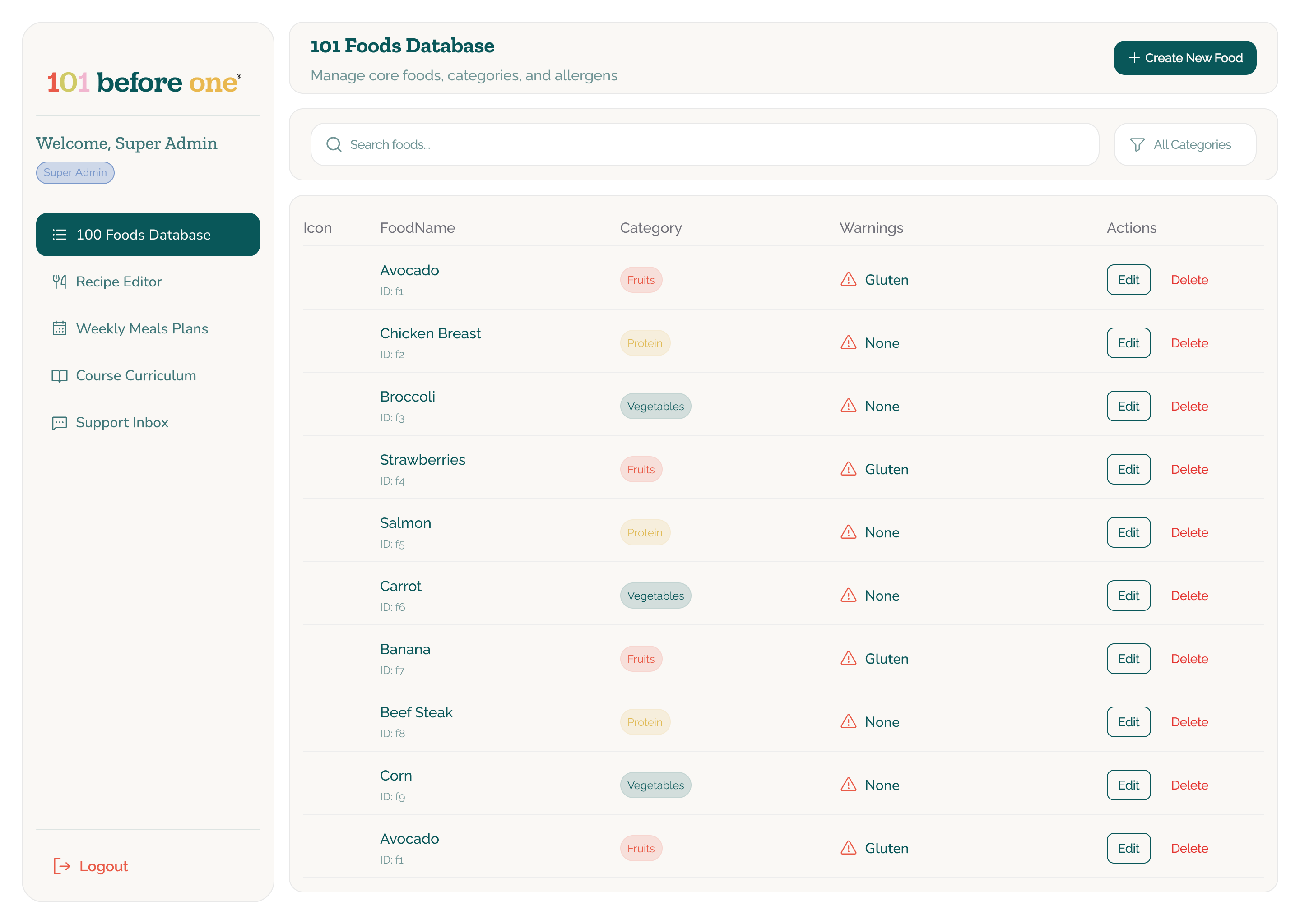
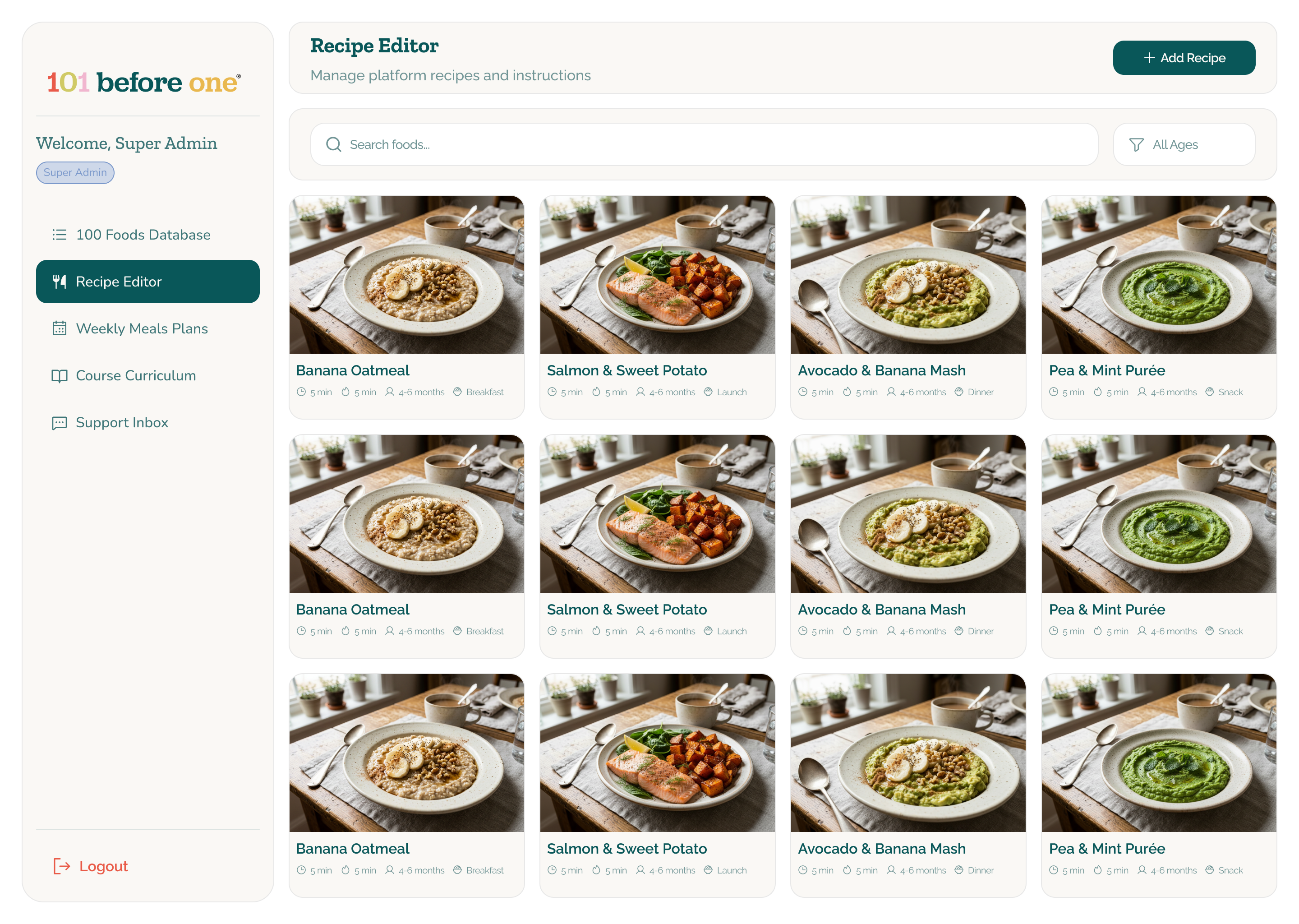
The admin experience gives the internal team dedicated tools for managing the food database and recipe library. Shared categories, age guidance, warnings and recipe attributes create a structured source for the content surfaced in the mobile product.
Publishing and support as part of the product
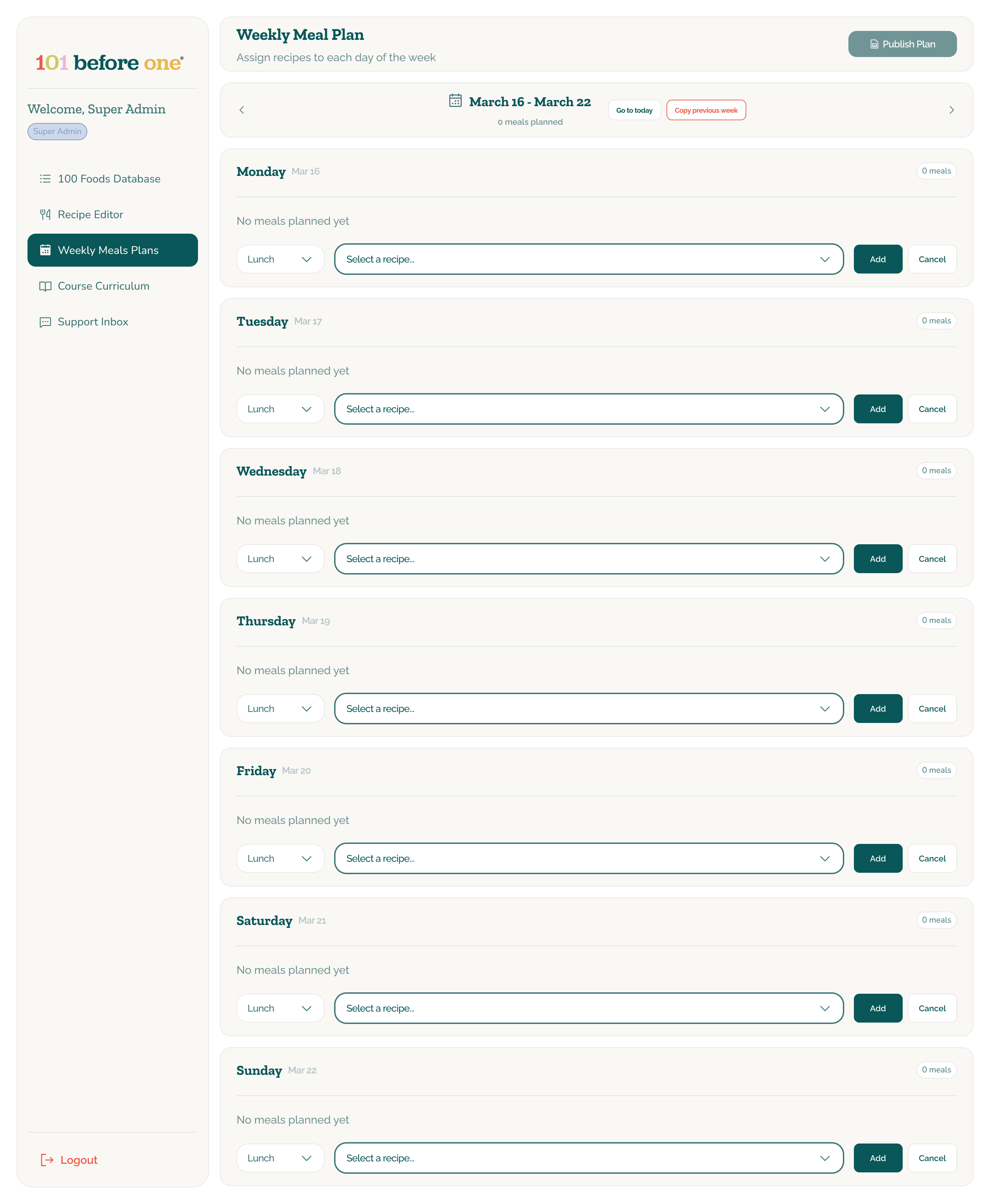
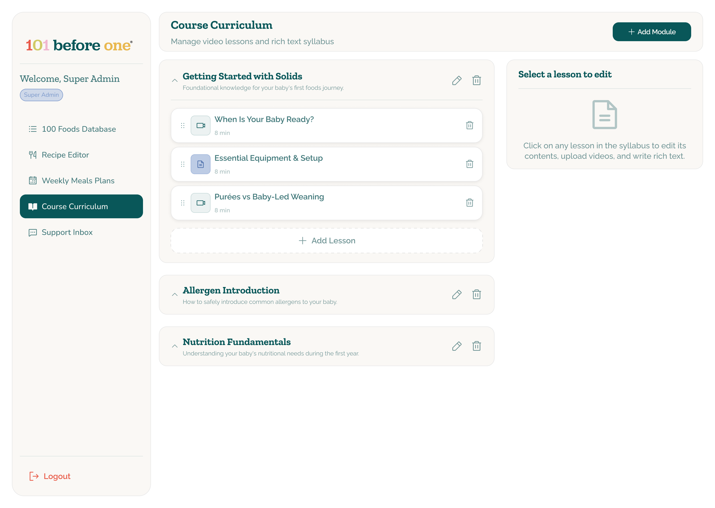
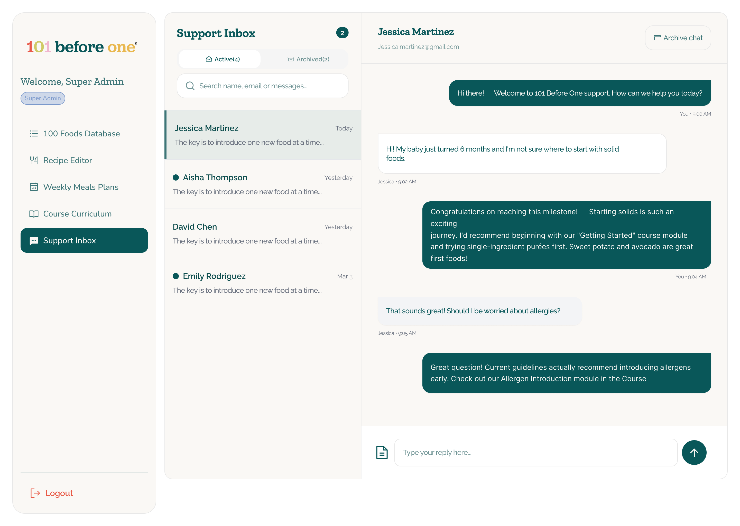
Weekly meal plans and course modules are assembled in purpose-built admin views, while the support inbox keeps parent questions within the same operational system. The design intent is to connect what the team publishes with the guidance parents receive.
Outcome
A complete product model, not a collection of screens.
The final high-fidelity design defines a connected mobile and admin ecosystem across onboarding, learning, recipes, meal planning, food tracking, shopping and support. It shows how parent-facing guidance can be created, organized and maintained through one coherent internal system.